Lincoln Sentry
A customer intuitive business to business webstore.
Role Client Timeframe
CX Lead DuluxGroup 4 months
Lincoln Sentry is a leading trade distributor of products in the building, renovation, furniture making and shopfitting markets. I was asked to apply a customer centric lens to the development of wireframes for their new business to business webstore on SAP commerce.
Challenge
The current website had usability, organization and functionality issues, causing problems for customers and staff. The challenge and goal for this project was to redesign the website improving the user experience whilst balancing requirements of the business
Process
Throughout this project I drove our design process and ensured it was user-centered. Below is a high-level overview of the process.
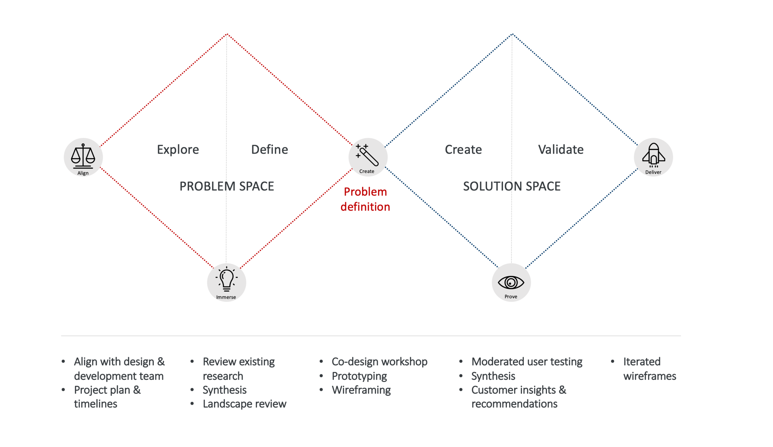
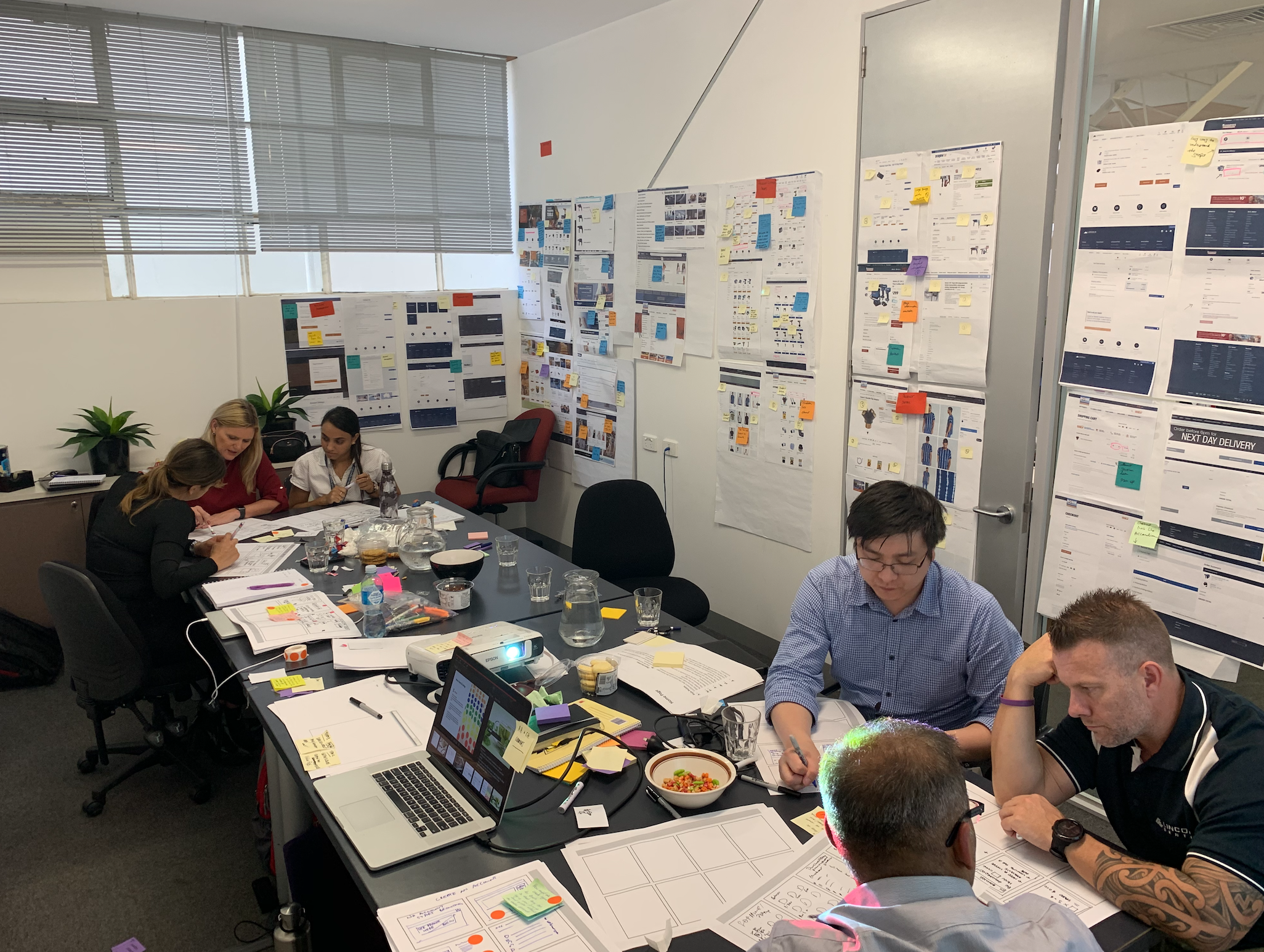
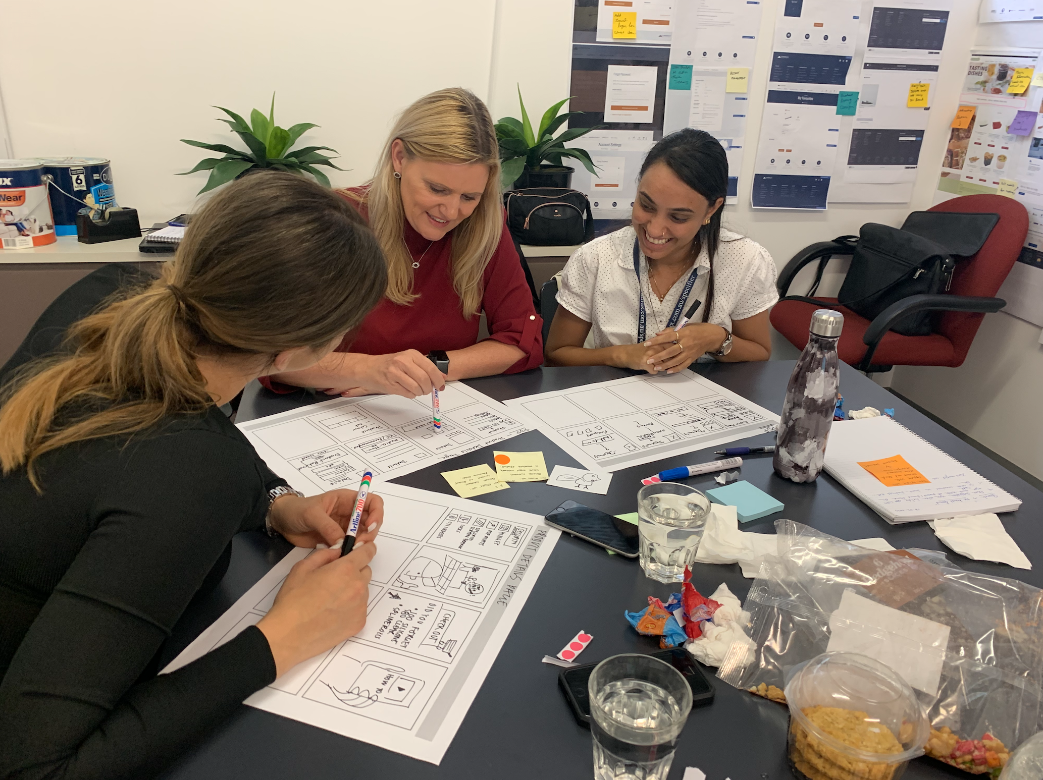
Co-design & alignment workshop
I facilitated a Co-design workshop. This was in effort to communicate design methodologies, shareback any of the existing research and the landscape and competitor review. The workshop would align the team on the project challenge, approach and timings. It would also prioritise areas for improvement by creating a solution that is of high value to the customer, technically feasible and is viable to the business.
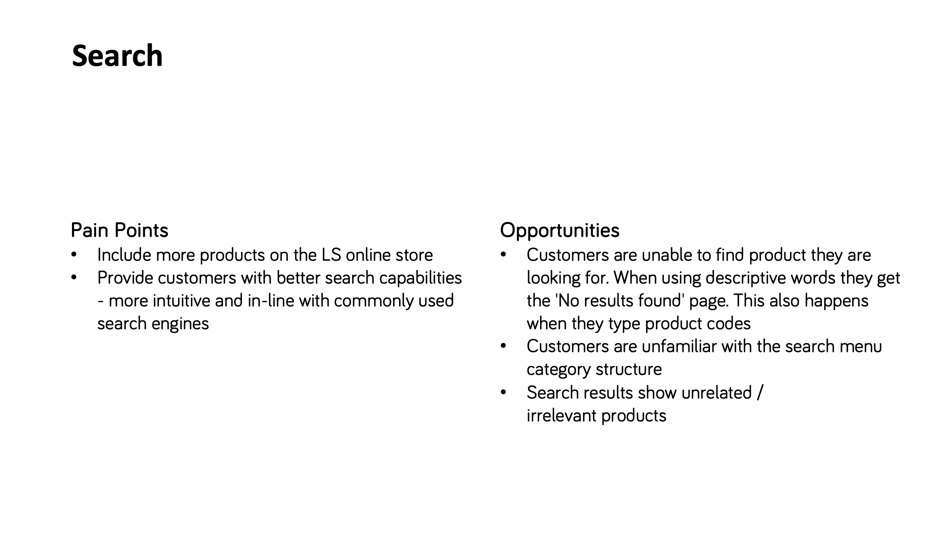
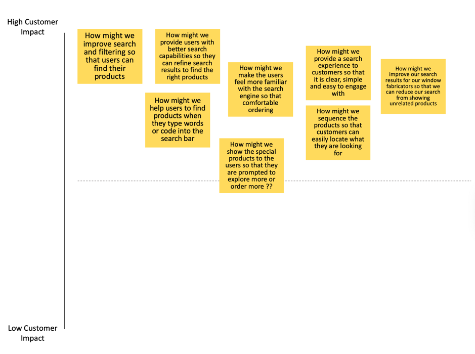
How Might We’s
With identified customer pain points and opportunities from existing research. We reframed these into ‘How might we….’ Statements - By rephrasing a problem into a HMW statement, we can suggest that a solution is possible. We used a Prioritisation Matrix exercises to show which HMW’s will deliver the most value to the customer. For example search:
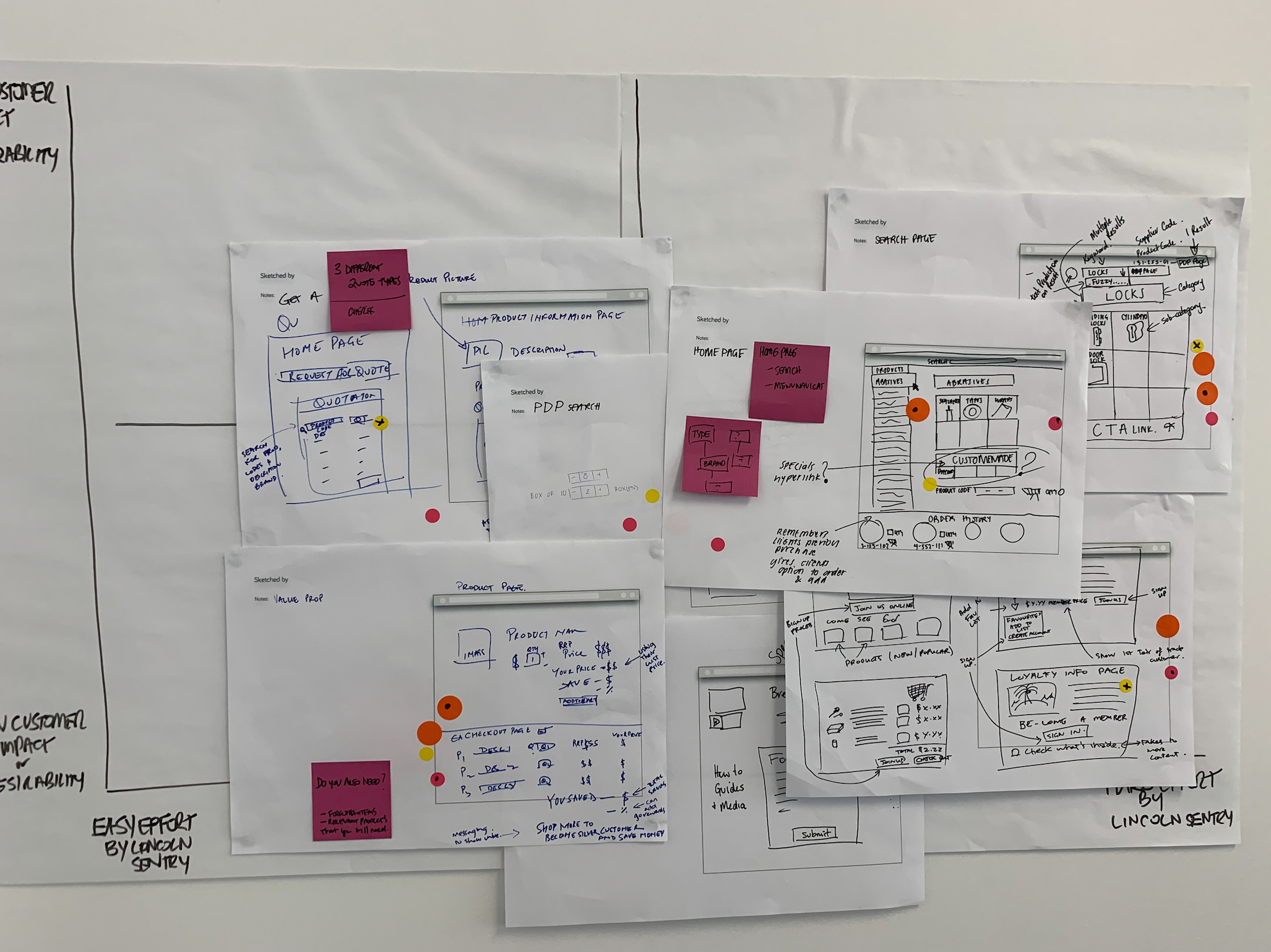
Ideation & voting
Those HMW’s that would deliver highest value to the customer, the teams began to ideate on. Each team member shared their ideas and discussed within their group. After the entire team had presented their sketches to one another, a round of voting was conducted to weed out any sketches that weren’t feasible and/or won’t help the customer.
Each team would discuss and amalgamate the ideas that received the most votes to come up with sketched website features. Each team then presented their ideas, features and functionality of the website to the group.
The group then voted on best ideas - What they would want as a Lincoln Sentry Customer. The ideas with the greatest number of votes would determine the direction the design would go in.
Prioritisation
By prioritizing features of the website we can think about what is desirable for the customer, easy effort by Lincoln sentry that can be included in phase 1 and what is harder effort that can be included into subsequent phases of the project.
Design sprints
We organized our work into design sprints, which included design collaboration with myself and UI designer, review with the full team, usability testing, executive leadership team review as needed, design revisions, and planning the following sprint.
Sprint 1
User sign in and log out
New account activation
Exploratory - Organizing a quote for a customer
Locating a product to purchase through to check-out
Home page
Information architecture
Sprint 2
Home page
Search tool
Favourites
Obsolete products
Order history
Promotions and pricing
Sprint 3
Search tool & search results
Exploratory - Favourites
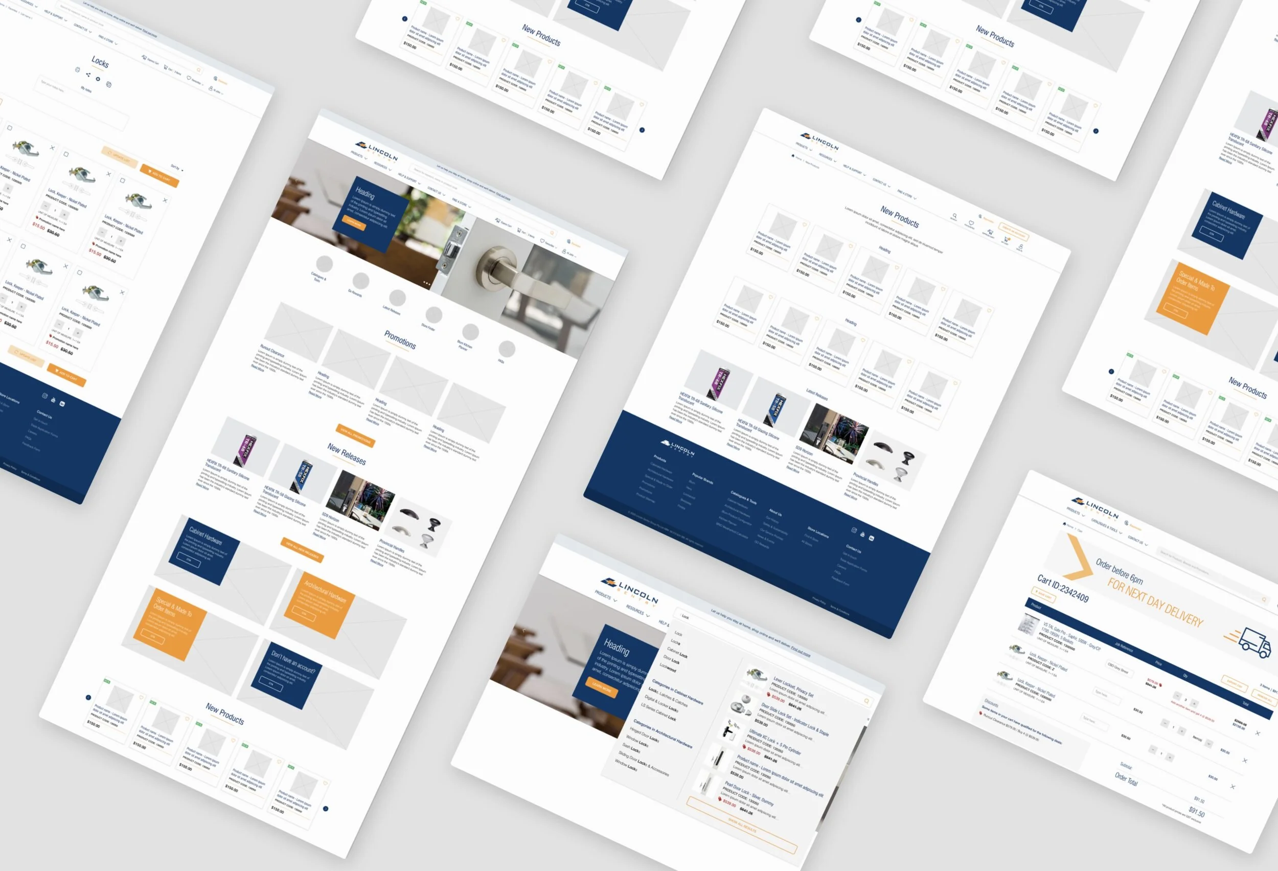
Low-fidelity wireframes
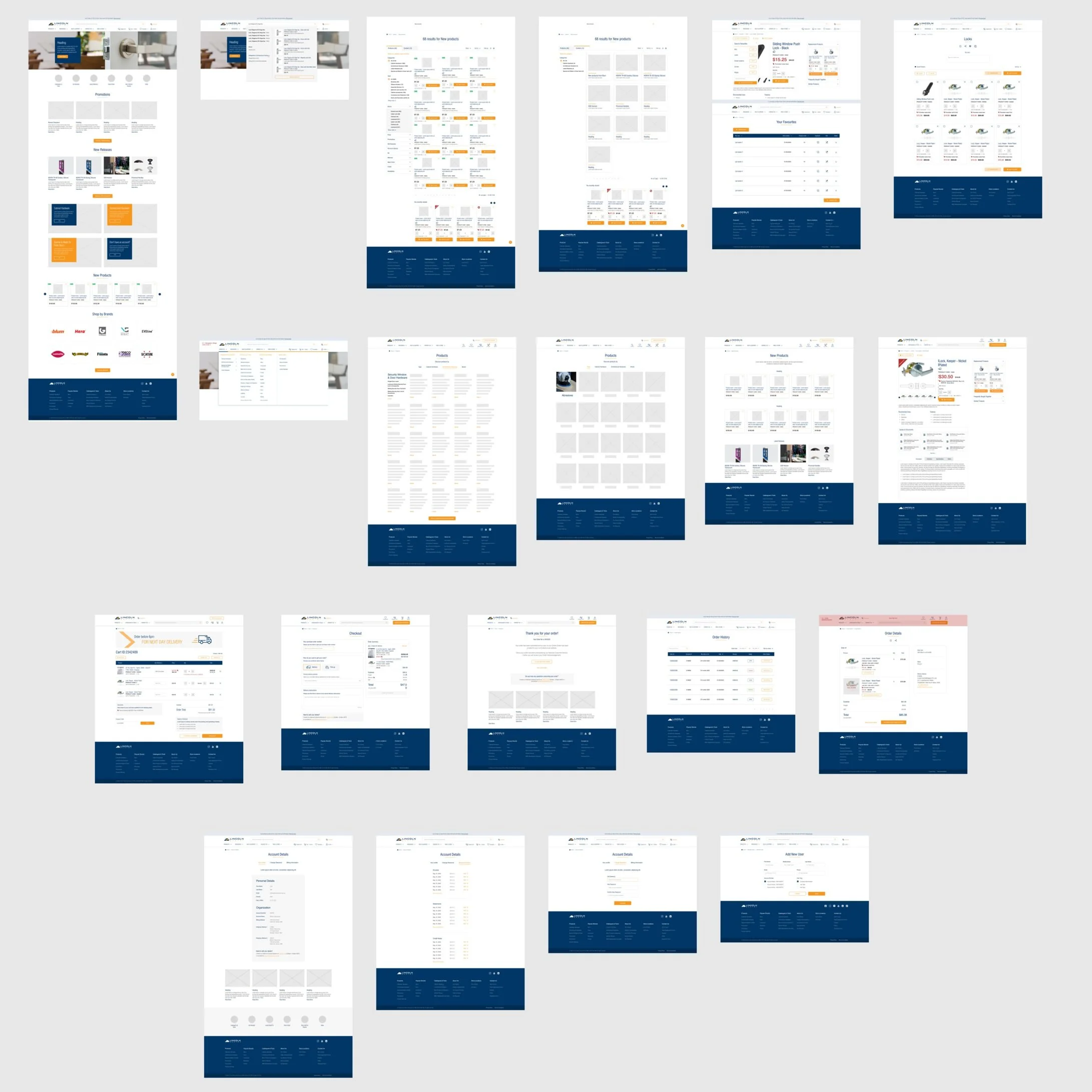
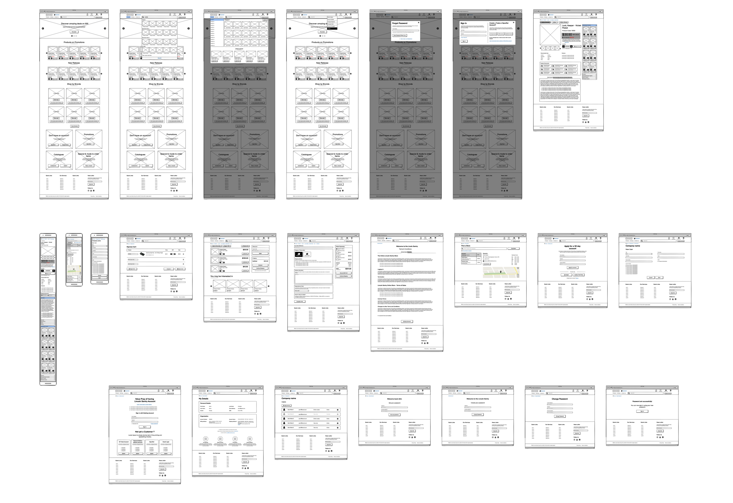
A selection of hi-fidelity wireframes
Moderated user testing
We put together interactive prototypes that we used for usability testing. For each sprint I assembled a report with observations, insights and design recommendations. This was shared back with the full team, reviewed through the lens of the customer and balanced with the business requirements before iterations were made and the wireframes were approved.
Wireframe Highlights
The following is a selection of recommendations and changes made to the wireframes. These are supported by customer insights from usability testing and Heuristics for user Interface Design
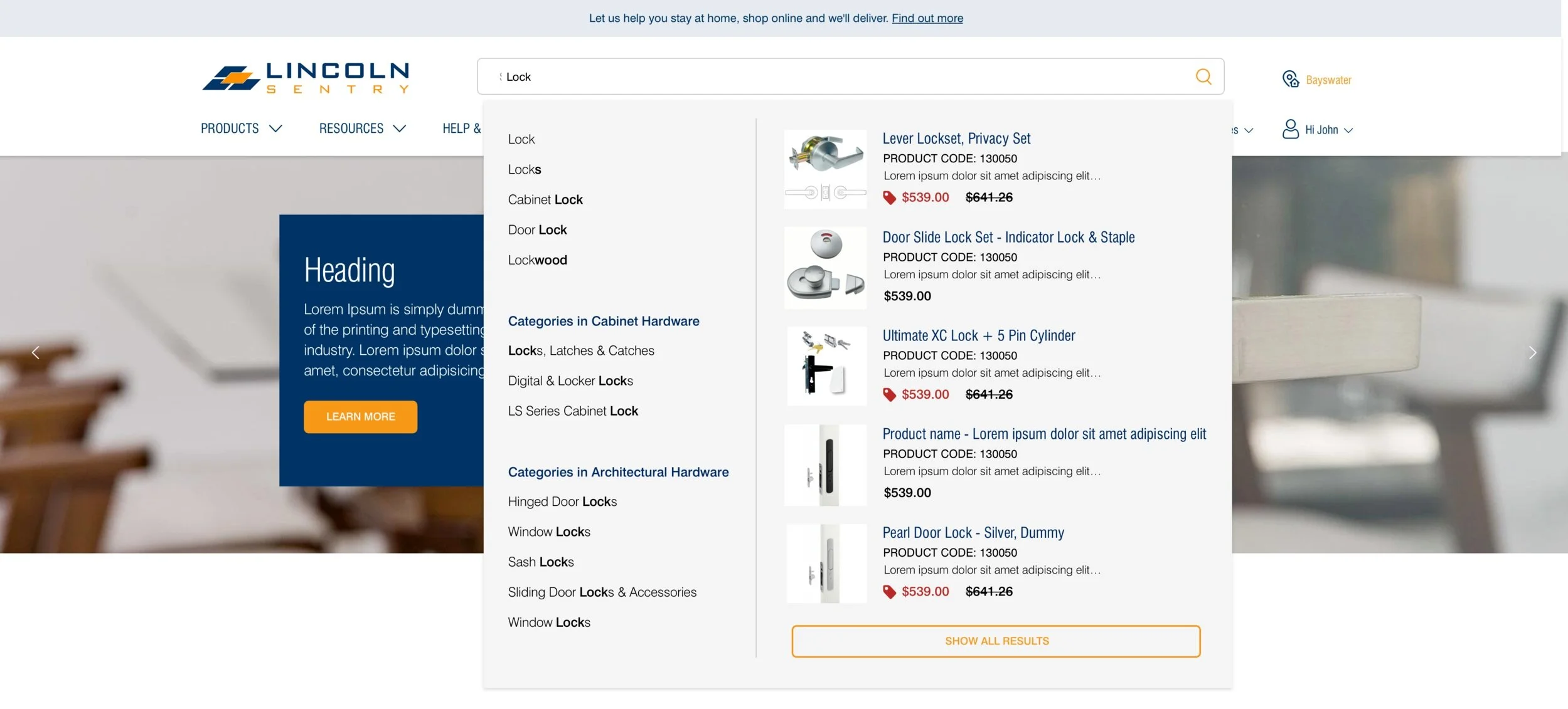
Pre-search results display categories and sub categories relevant to the search term. Customers would expect to see products (right hand side of the box) that were only related to Cabinet or Architectural Hardware depending on their industry. As well as frequently bought products – either they had purchased before or popular products that customers purchase regularly.
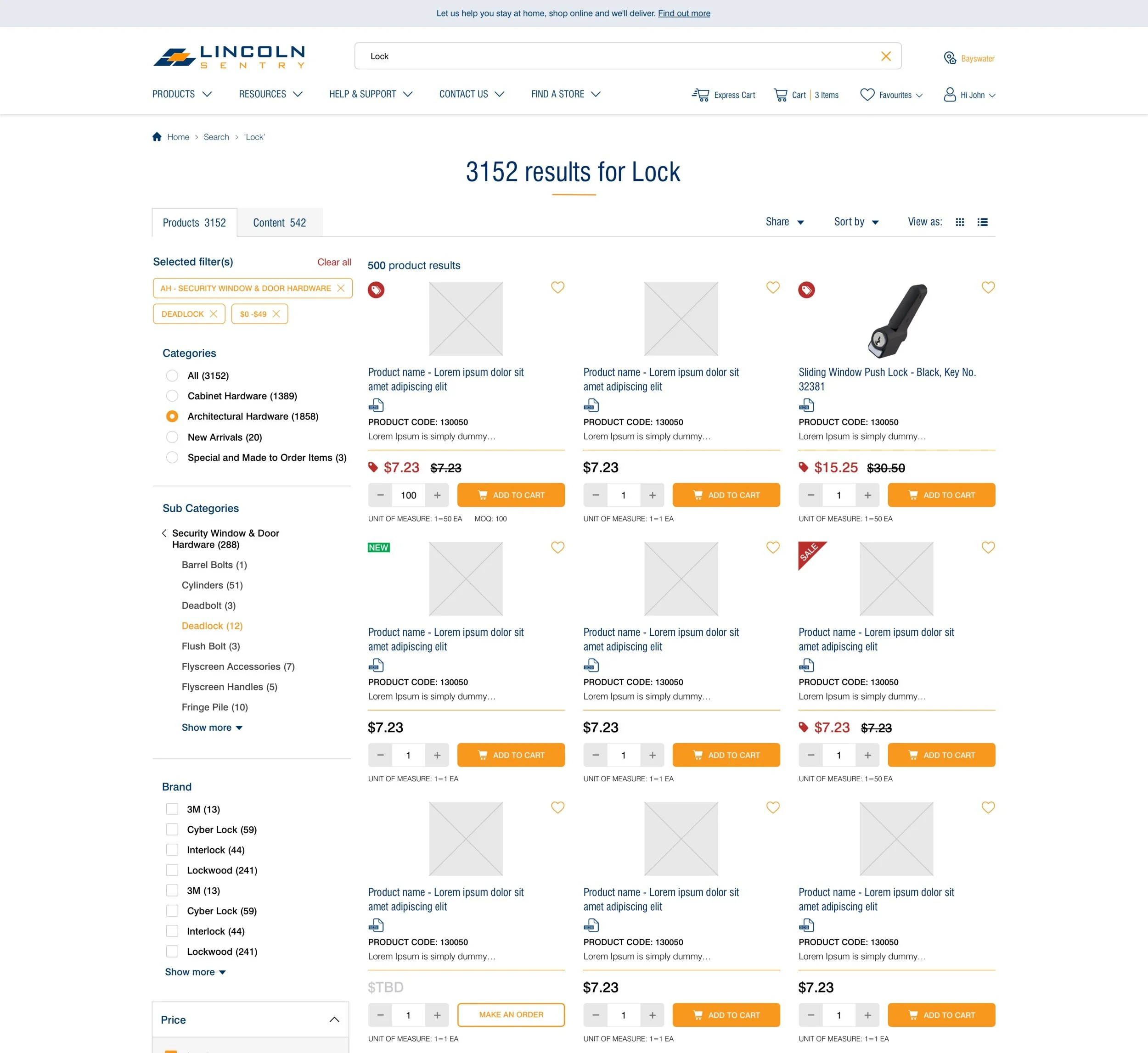
The search results pages allows customers to have flexibility in refining their results based on categories, brand, price and other attributes. It also allows the customer to explore other forms of content relevant to the product they are searching for.
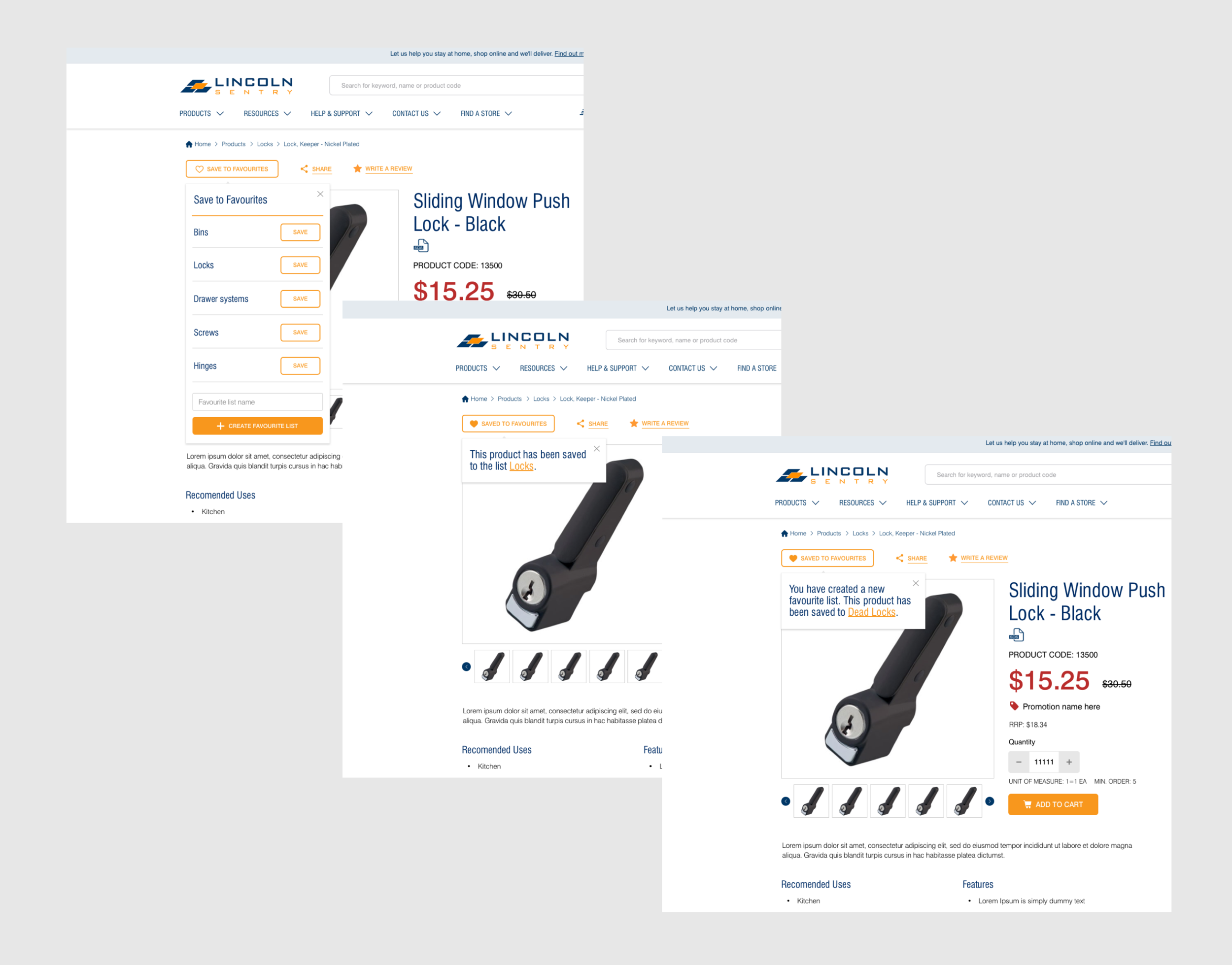
'Saved to Favourites' button clearly communicates this functionality to users. To improve the user experience we recommended a single dropdown widget instead of multiple popups (current state) The widget allows customers to create a new list and add a product to an existing list within the same dropdown. It also gives the customer immediate confirmation that lists have been created and products added.
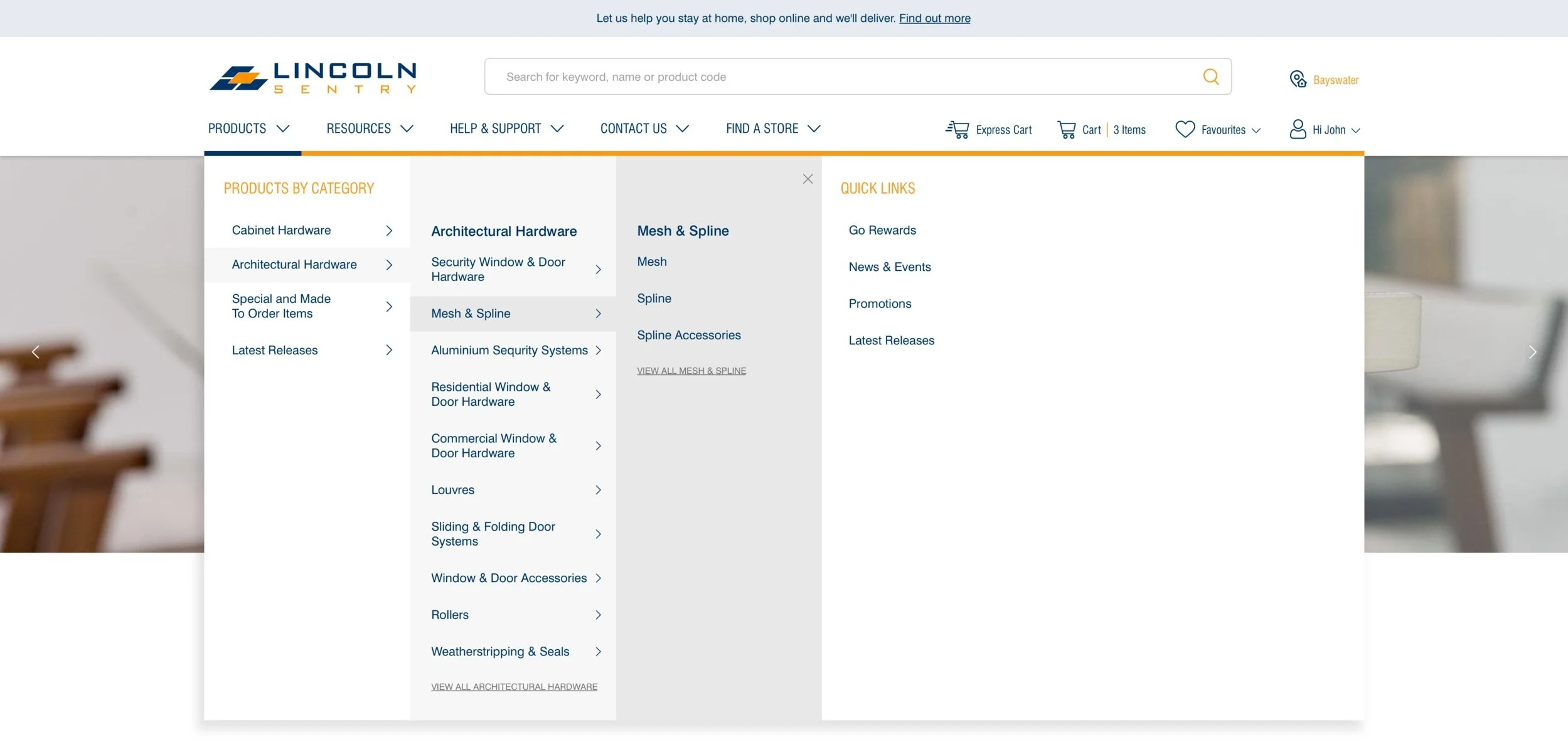
For primary navigation a Mega-menu was proposed - This which was constrained by the current information architecture. This menu allows space for sub-categories that are 6 deep. It allows the user to scan categories easily through shading in what they have selected.
Outcome
Phase 1 of the project required us to deliver the first round of high-fidelity wireframes. Future phases of this project are currently being re-scoped and aligned with the product road map. The MVP to be delivered in Phase 1 expects to go live in the coming months.